00:00
00:00
Magnum47
Redneck and WWII Reenactor.
12. ϟϟ Pz. Div. 1./Pz. Gr. Rgt. 25 ,,HJ''
80th Infantry Division
702nd Tank Battalion "Red Devils", Company B

Kai @Magnum47

Age 22, Male

Warehouser

Easton Area High School

Somewhere in Pennsylvania

Joined on 10/4/13

Level:
5
Exp Points:
196 / 280
Exp Rank:
> 100,000
Vote Power:
4.17 votes
Rank:
Civilian
Global Rank:
> 100,000
Blams:
0
Saves:
2
B/P Bonus:
0%
Whistle:
Normal
Trophies:
1
Medals:
229

NEW TEASER | VERGLEICH : NEU ODER ALTE

Posted by Magnum47 - October 9th, 2016


Well? Which do you prefer? the new (left) sprites or old (right) sprites?
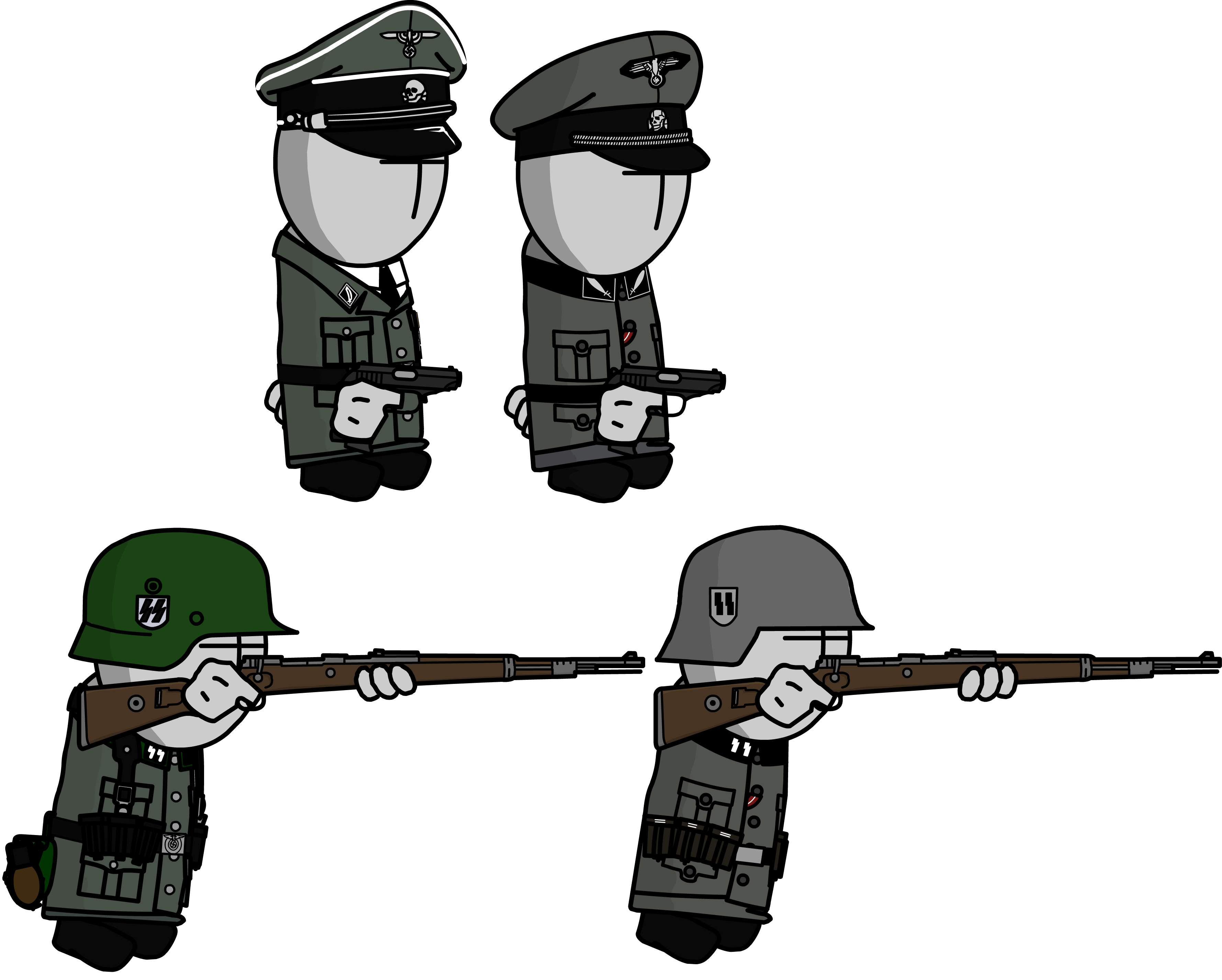
4810081_147599503272_VERGAlteOderNeu.pngThis post is only comparing a Officer (Colonel/Standartenführer) and a Rifleman (Private/Schütze) as they are the only ones currently "presentable"

Each one has the exact same pose as the other, the only differences being the left side is COMPLETELY redone.


Comments

The Left ones look more detailed and generally better,
but the helmet kindaa looks too saturated, the color needs to be a bit duller (I guess thats the word)

When I made the helmet I was basing it off of the old pre/early war Apple Green helmets. They were only issued during the Poland campaign. In the sheet there are also Feldgrau helmets if you don't want to use the Apfelgrun

left

Obviously the left, it's nice to see that you putted the field equipment too, the only criticism i want to give is the pouches, the contrast is low and too dark, but this is just an opinion. Anyway you did a great job! ;)

If you mean the width of the lines of the pouches I kind of agree. I was considering changing it from 1.00 to 0.50 or 0.25. I made it 1.00 instead of smaller widths so that the 3-D pouch effect would work, given the default bodies black lines are at 1.00.

I already have roughly 7 or so tunic types made, so it would be a difficult change.